Breathe is a product of RoundGlass
firm.
RoundGlass
aims towards building a vibrant ecosystem of innovative
products and services that cater to the holistic well being of an individual. There are several projects, under the
umbrella of RoundGlass, that are designed to address different aspects of wellbeing. Breathe is one such that it
involves designing a system around doctor and patients to manage ‘respiratory’ conditions.
It mainly consists of an Asthma app for Indian Pulmonologists and their patients in metropolitan area. Breathe apps uses google’s material design framework to provide the modern app user experience for patients on android phones.
1. Research
For this project, product management team and the design team decided to first focus on patient app because of easy availability of resources and knowledge.
We strategically then involved doctors to refine the patient app and designed a web
application for them by considering their requirements and needs to manage Asthma condition of patients overall.
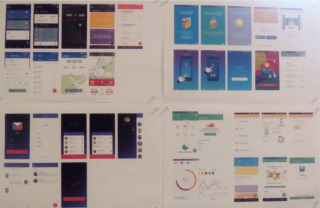
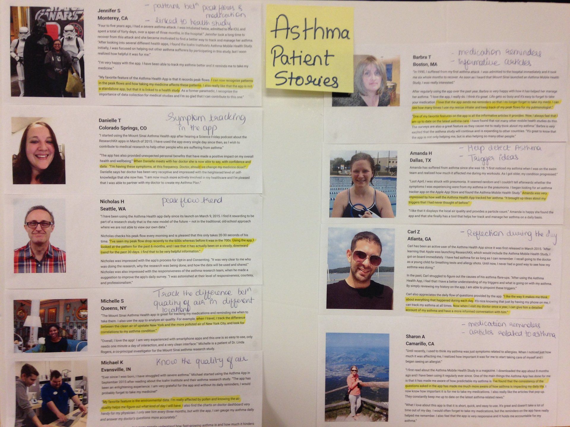
We (the Senior Designer and I) started this project by studying popular asthma and health tracking apps in the market like Asthma Pal, Asthma Check, Asthma Health by Mount Sinai, etc. to understand different approaches and draw inspiration from them.
Setting up the inspiration board helped us sift through different workflows in the existing apps. We were inspired by
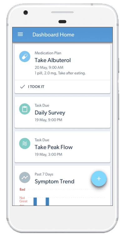
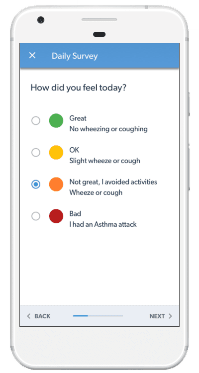
‘Dashboard Home’ approach by Mango Health app as a way to display notifications and entry points to important sections of the app. Mount Sinai’s ‘Daily Survey’ tool is a unique way to capture data from users without being
interrupting.
2. App Flow
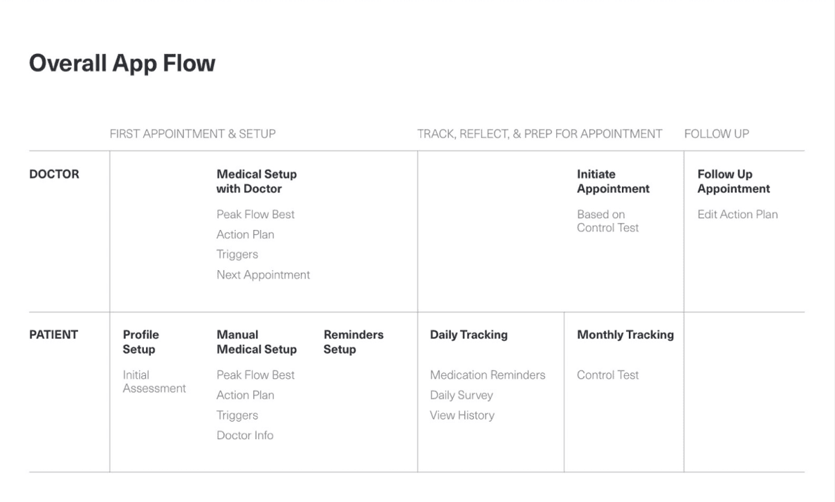
Next, we (the design team) determined the overall app flow by collaborating with business analyst and product manager. This helped us in understanding the system overall and identify experience touchpoints for patients and for doctors.
The exercise also gave me a perspective of what experience we wanted to give to our users. How do we create dependency or independency of doctor/patient app in the system? And how do we integrate user needs with business needs and technological constraints.
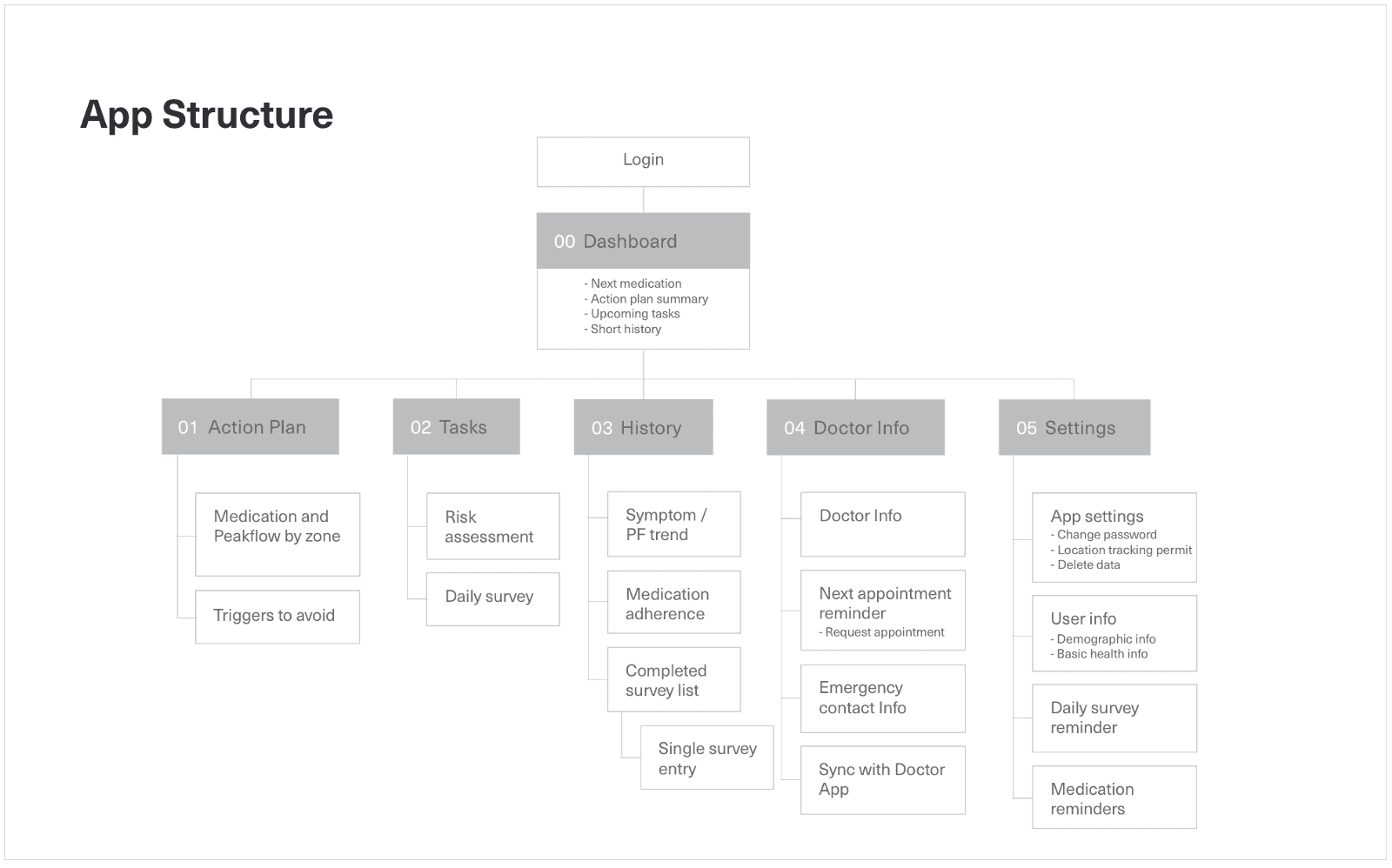
3. Patient App Structure
The intelligence of an app depends on how well a workflow is designed for individual sections of the app. We invested a lot of time in ironing out the details for every important piece of the app and did several revisions on it.
We brainstormed on the workflows for following sections:
1. User on-boarding
2. App Setup (General demographics, doctor and medication setup)
3. Manual tracking
4. Daily survey
5. Settings (Account, personal info, reminders)
6. History and Insights
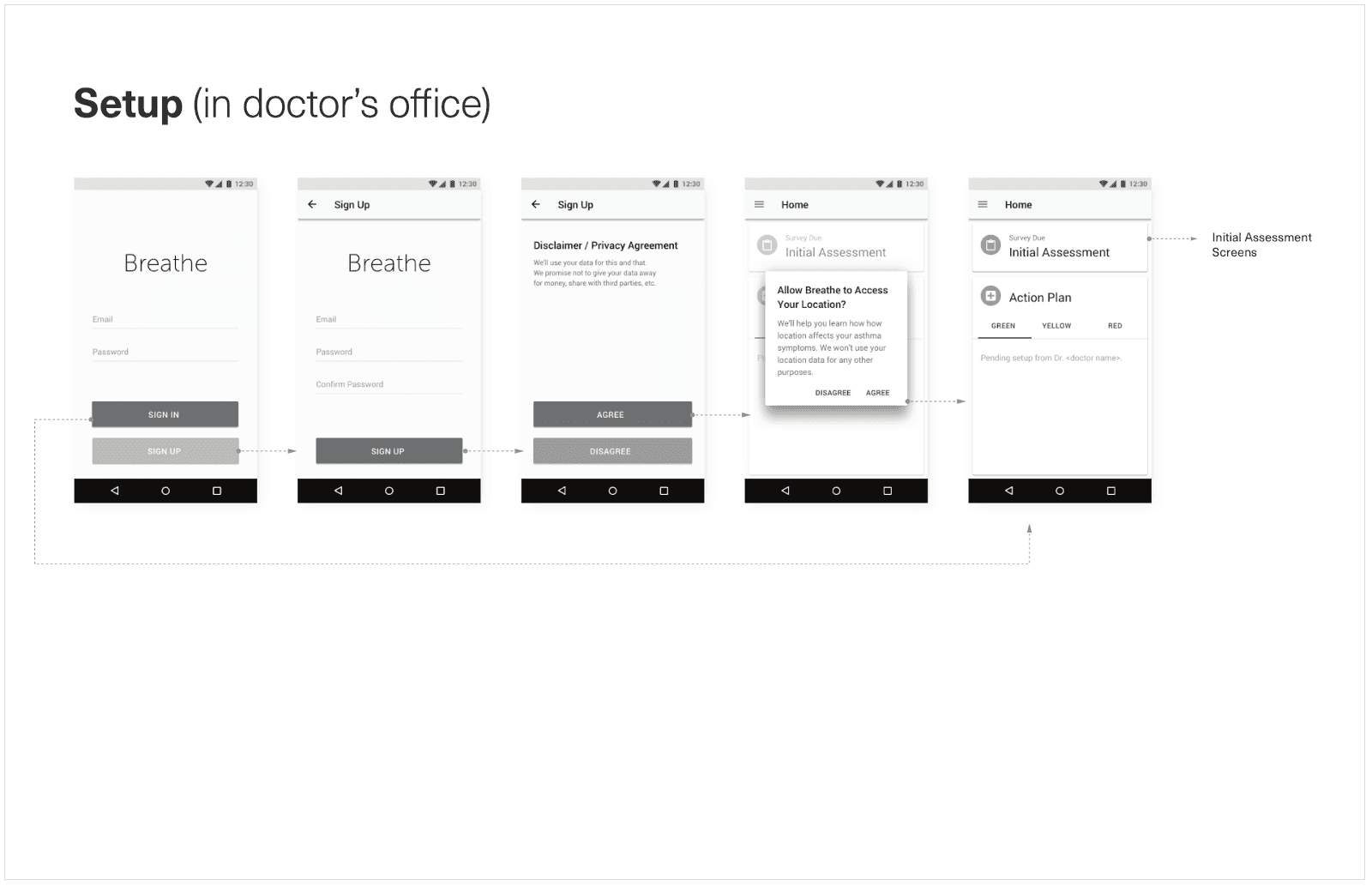
4. Lo-fidelity Protype
Next, we (the design team) translated the rough flow into black and white screen designs
and presented them to the product managers to get their feedback. The process was repeated for individual sections until everyone on the team (designers, business analyst and product managers) consented to the flow design.
Once the low fidelity wireframes were ready, I made a quick prototype in marvel to make sure all the flows makes sense for the app.
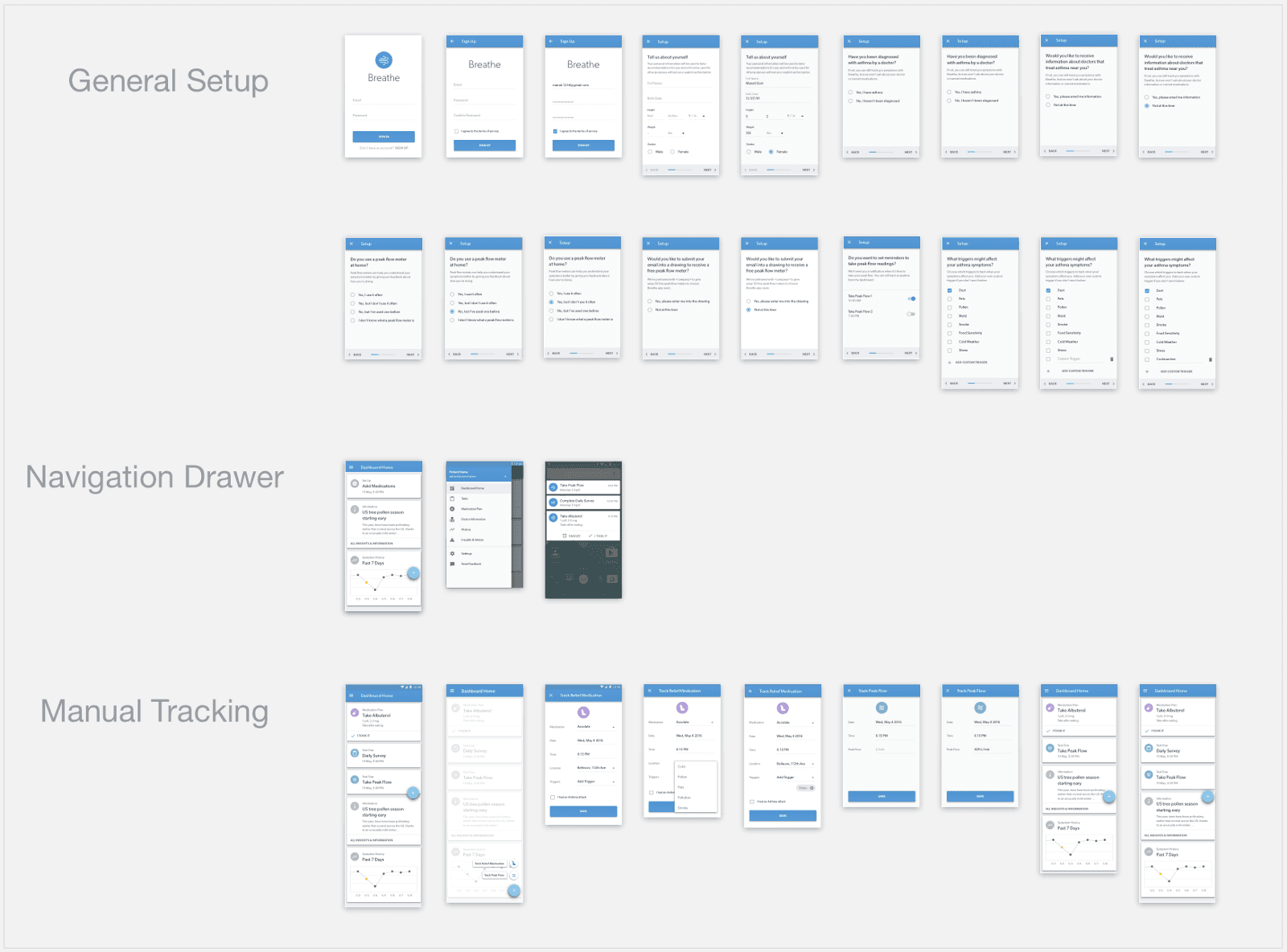
5. Hi-fidelity Mockup
Next step was to add visual design to the low-fidelity wireframes and make them hi-fidelity mockups.
I worked with different color palette, iconography, typography, etc. to determine proper look and feel for the app. Then, I started converting each black and white screen into an almost finished screen design..
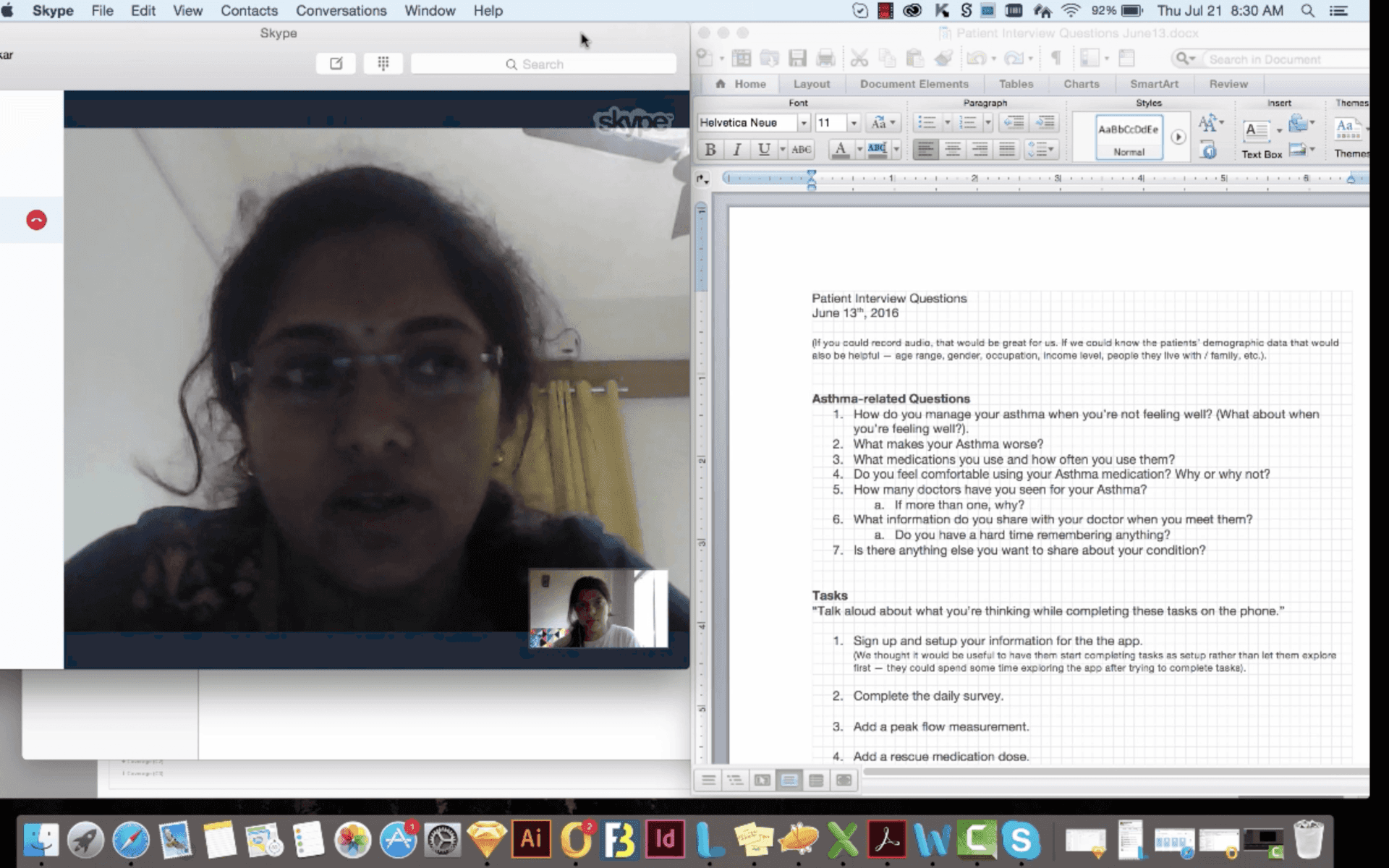
6. Remote Usability Testing
Usability test was conducted remotely with few Asthma patients in India living in metropolitan cities.
Patient
interview questionnaire was created that consisted of questions regarding Patient’s Asthma history and some tasks on app. Usability findings are listed below.
Usability Testing Takeaways:
Regarding App Design
a) Floating action button is confusing to operate
b) Patients don’t have much info about Peakflow meter
c) Report sharing with doctor was not apparent
User Suggestions
a) Include ‘Find a doctor’ feature that will help people to locate Pulmonologist nearby
b) Include ‘how to use nebulizer’ video on information and insights screen
c) Patient wanted to know popular Asthma medications from
community of App users
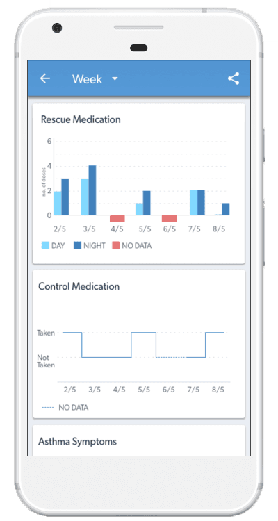
Final Design consists of Android app screen designs. Following flows were addressed in the app: Signup, Login, General Setup, Doctor Setup, Medication Setup, Daily Survey, View History, View Insights, Settings
Interactive prototype link: Here
1. Early Design
After patient app, I started designing for Doctor App. Product management team and I decided to design a
responsive web app for doctors so that it works well on different devices used by them.
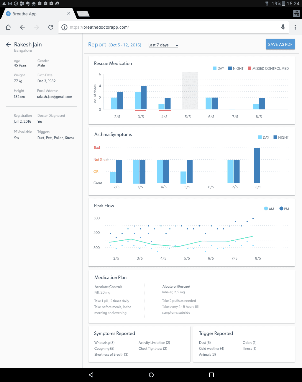
The requirements for doctor app were pretty simple - Search patients using Breathe app registered in the system and pull up their reports. Each doctor will have several patients connected to him through the app.
With easy requiremnts in hand, I continued with the same ‘look and feel’ of patient design
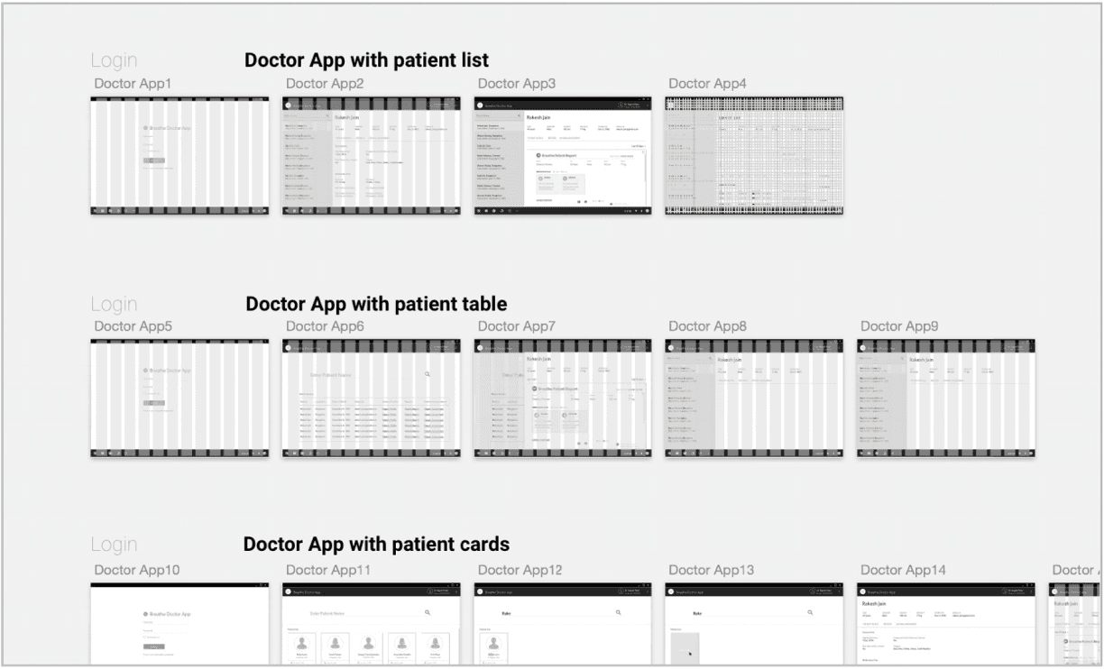
to make it look part of one application. I explored different approaches to determine the optimal workflow.
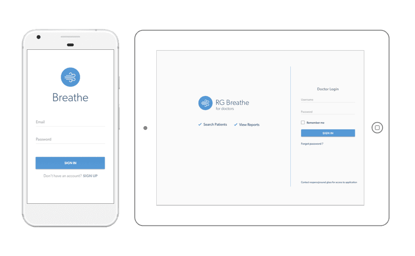
Final Design for Doctor App consisted of web app designs.
Following flows were addressed in the app: Login, Forgot Password, Reset Password, Search Patients, View different reports
Interactive prototype link: Here
Breathe app was released into the market. Breathe is one of my favorite design projects at Roundglass because of many reasons:
• It was one of my first projects to design a mobile app. I got a good understanding of Android OS and Google’s material design framework in the process.
• Designing for Breathe involved designing for the entire doctor - patient ecosystem. I got to work on the idea right from the scratch. I was involved in the early discussions with product managers and the senior designer to decide on the vision we wanted to achieve in this project.
• Design for social good. As a designer, I got great satisfaction to be a part of something meaningful. I was very happy to receive positive remarks on the app while doing the usability testing.
• Working in agile methodology. Once the MVP was built, our product manager scheduled monthly release to incrementally improve the design of the app. This approach helped me prioritize different design tasks and work closely with development team during their sprint cycles.

