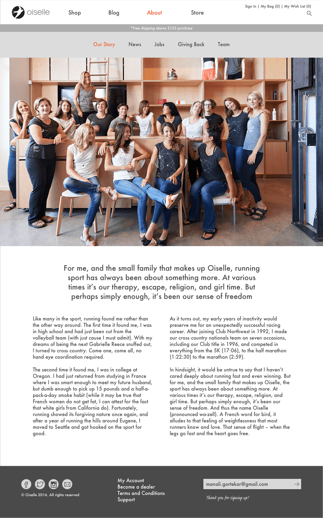
Oiselle web refresh is a website re-design project to better express Oiselle’s vision of ‘feminine fierce’. Oiselle is a Seattle based women’s running and athletic apparel brand.
Oiselle web refresh was an individual assignment for Web Visual Design Program at School of Visual Concepts
, Seattle.
The 10 week program was instructed by Bryan Mamaril (Sr. Designer at Microsoft) where the attendees studied and applied web design principles on the project assignment. The final design was presented in the class to client.
The Creative Brief
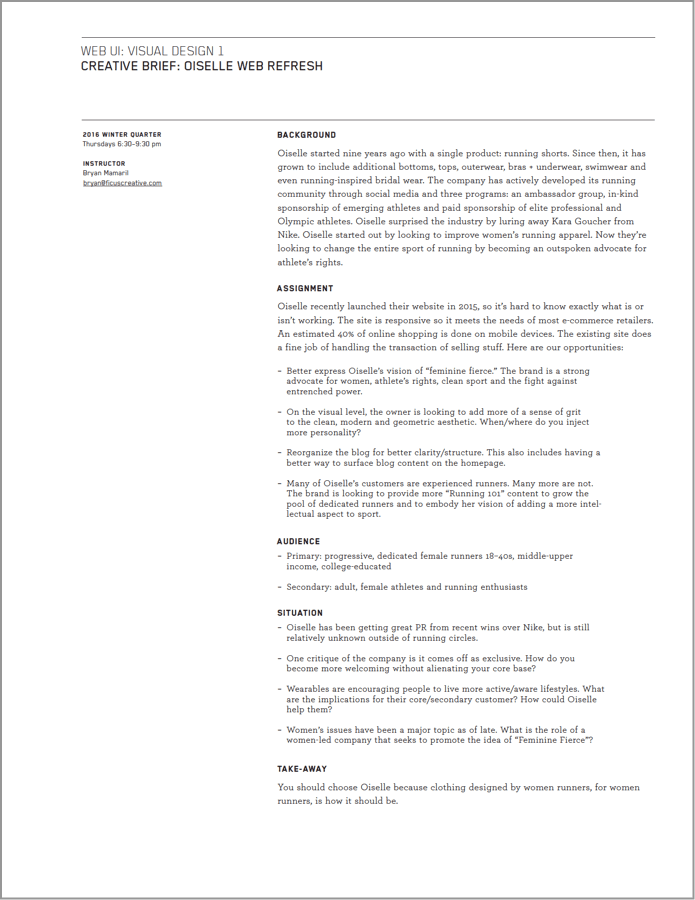
The creative brief was shared by the client to the entire class along with art direction images and text content on what they wanted to achieve through their website. Oiselle
recently launched their website in 2015, so it's hard to know what is or isn't working. The existing site does a fine job of handling the transaction of selling stuff. But there were following opportunities to improve:
• Better express Oiselle's vision of "feminine fierce".
The brand is a strong advocate for women, athlete's rights, clean sport and the fight against entrenched power
• On the visual level, the owner is looking to add more of a sense of grit to the clean, modern and geometric aesthetic. When and where do you inject more personality?
• Reorganize the blog for better clarity/strucutre.
This also includes having a better way to surface blog content on the homepage.
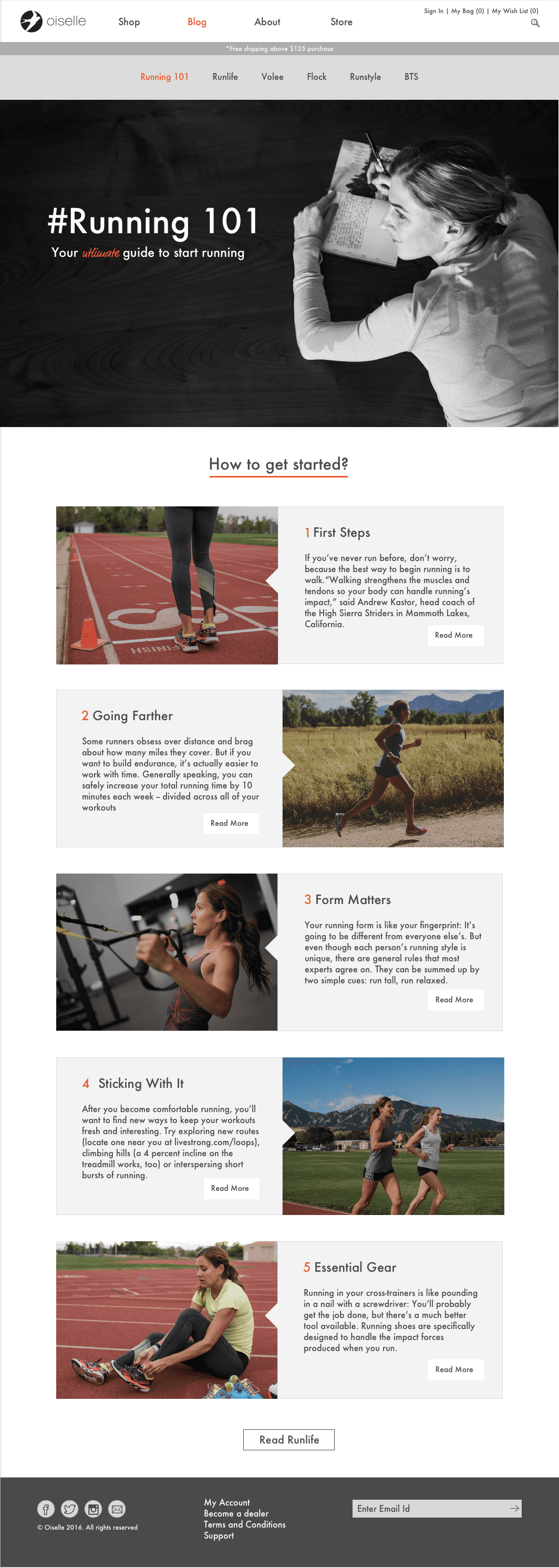
• Many of the Oiselle's customers are experienced runners. Many more are not. The brand is looking to provide more "Running 101" content to grow the pool of dedicated runners.
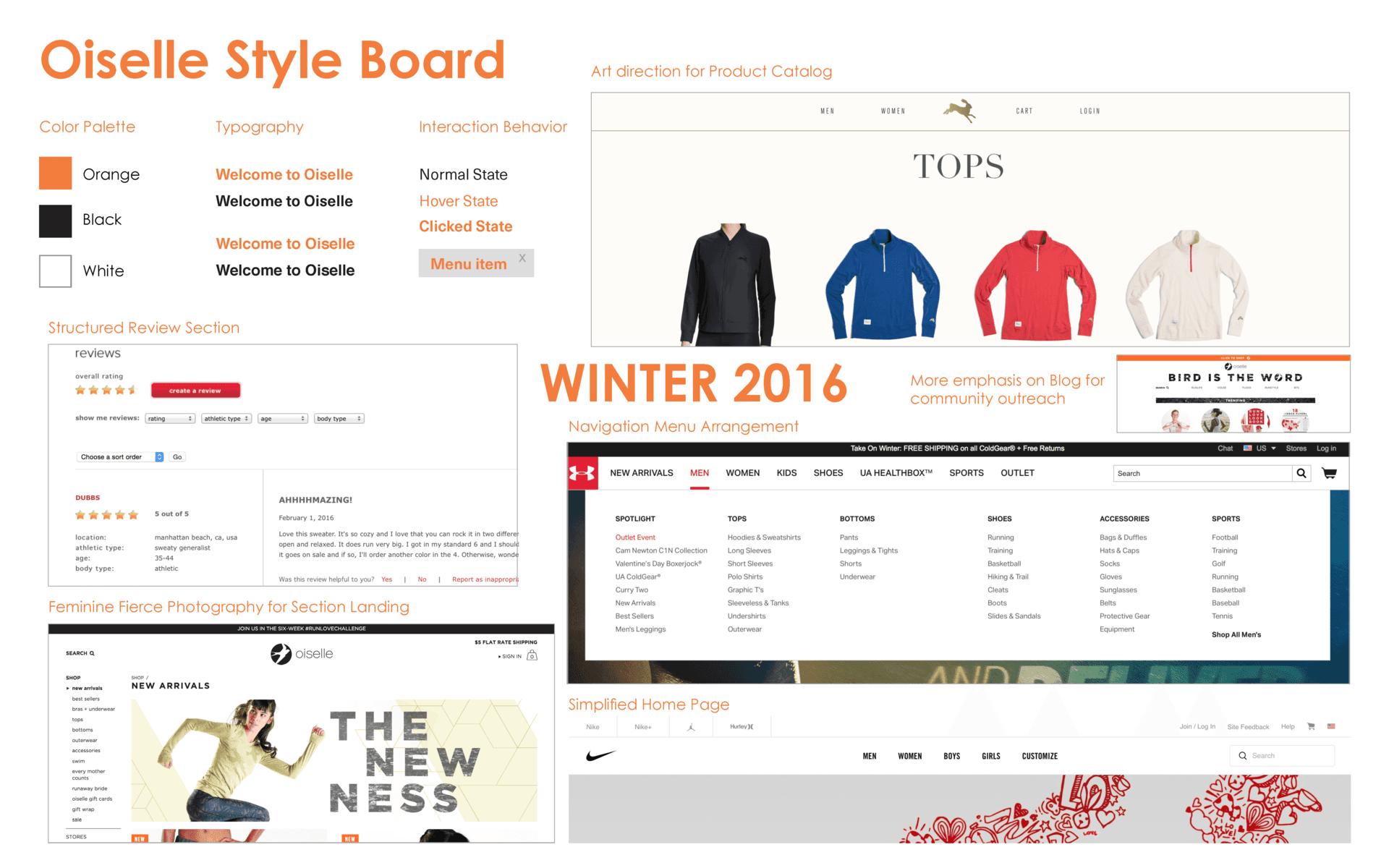
1. Inspiration / Style Board
The project started with research assignment. I asked my research subject to do a mock purchase on existing Oiselle website. One key finding was that the size chart on the current website was not easy to understand while purchasing an item online.
I created an inspiration/style board where I collected my favourite visual design examples from other brands to refer them while re-designing Oiselle website. I studied the website design of other brands with similar vision or similar products as that of Oiselle.
This included Patagonia, Tracksmith, Nike, Underarmour, Everlane and so on.
2. Oiselle Sitemap
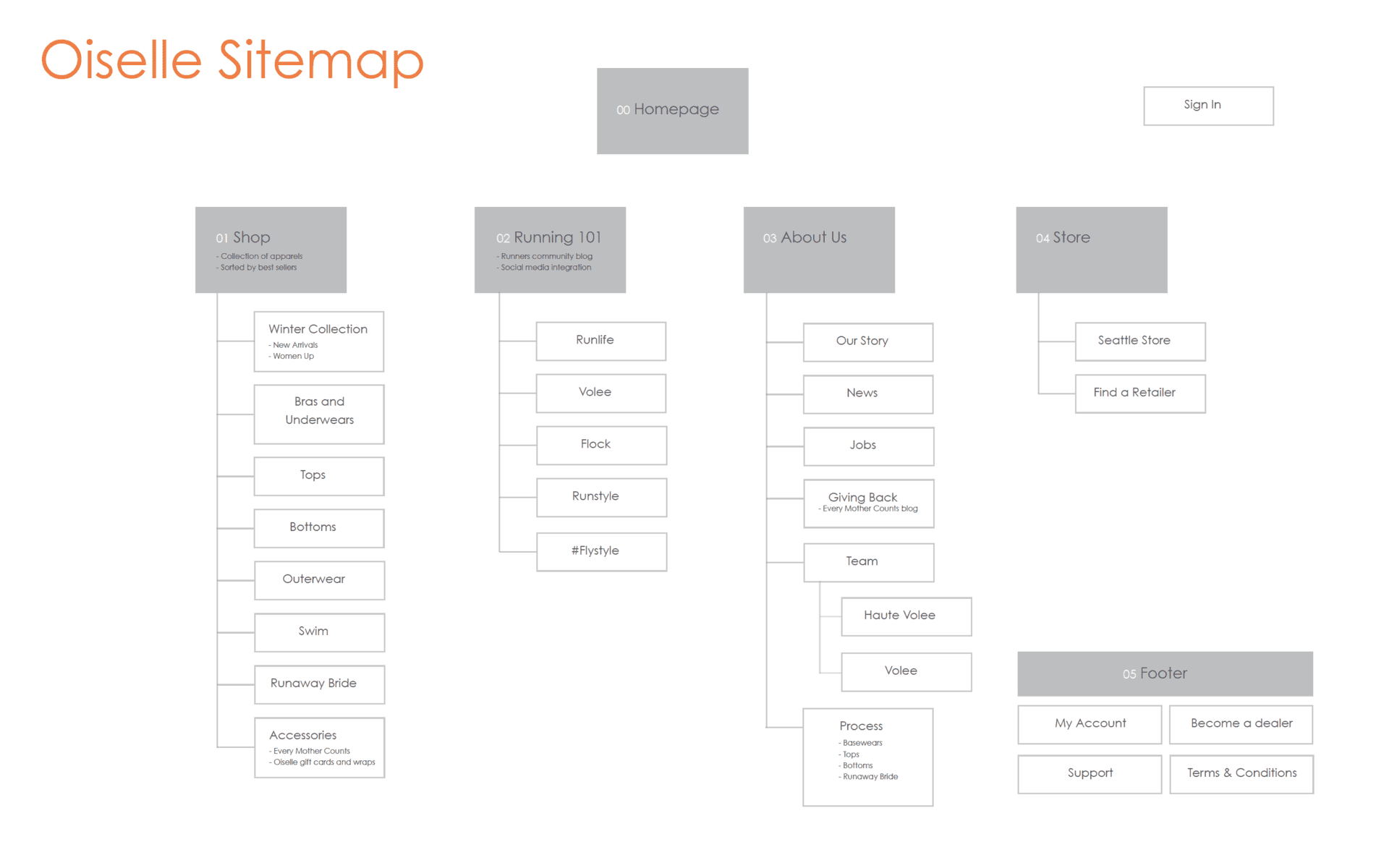
I created a sitemap for the new Oiselle website where I re-organized the content, navigation model and structure of webpages. Also optimized the navigation menu options at the top of the webpage.
a. I simplified the shop menu options.
by combining the merchandise items together into 'Accessories'.
b. I made Running 101 as a part of blog
along with the other blog contents.
c. About us section was optimized
by combining the story, process, personal philosophy together.
3. Wireframe
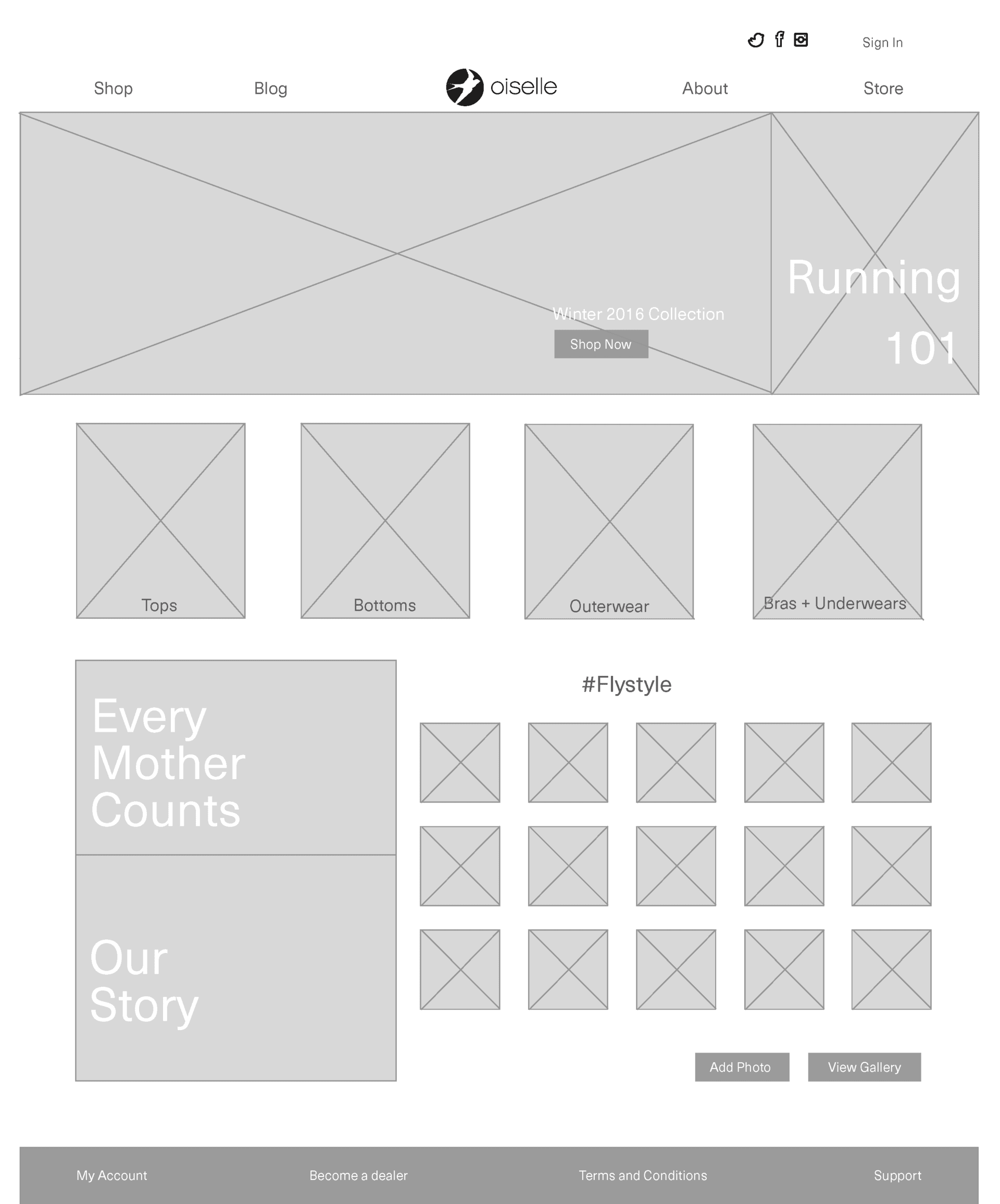
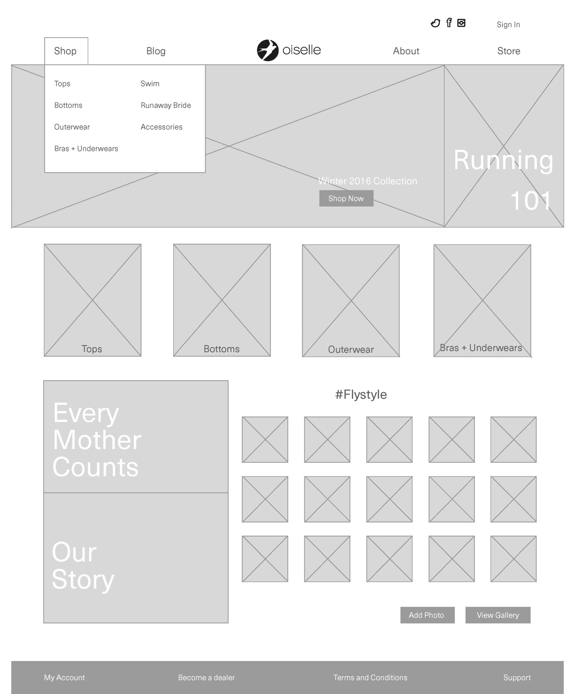
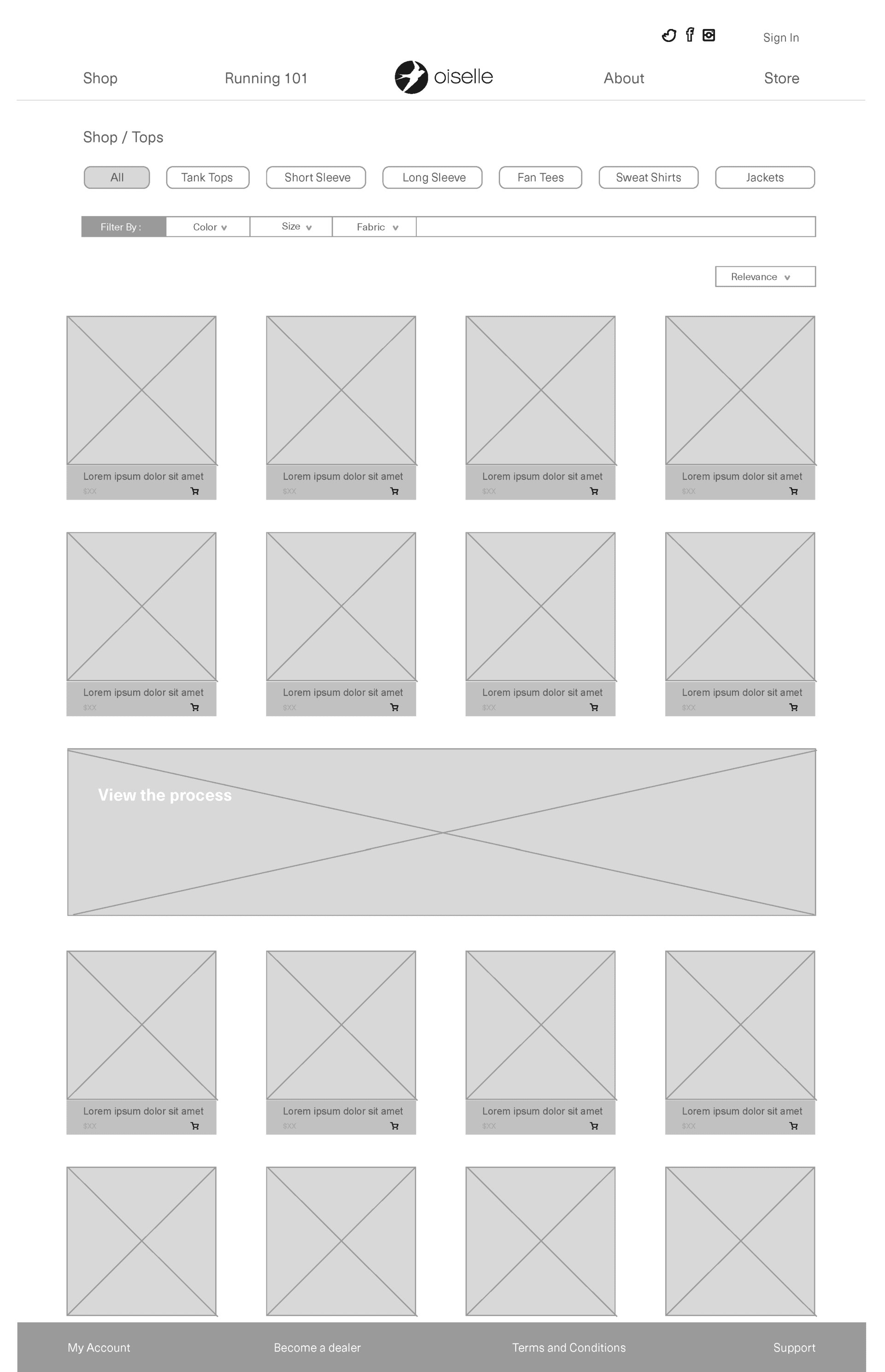
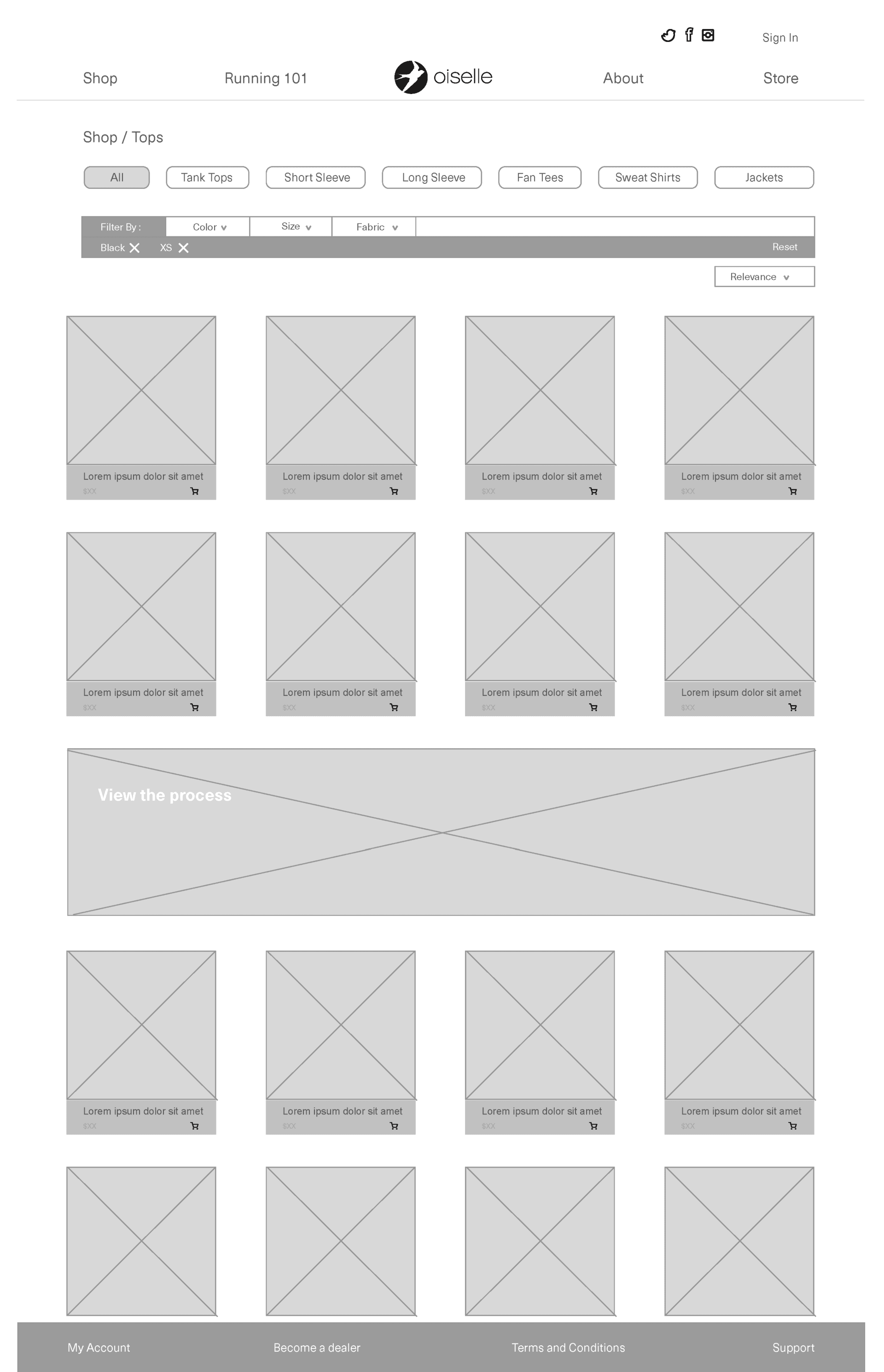
I created wireframes based on sitemaps to determine the placement of content on webpages. The wireframes were black and white designs with placeholder images and pseudo text.
Homepage Variations
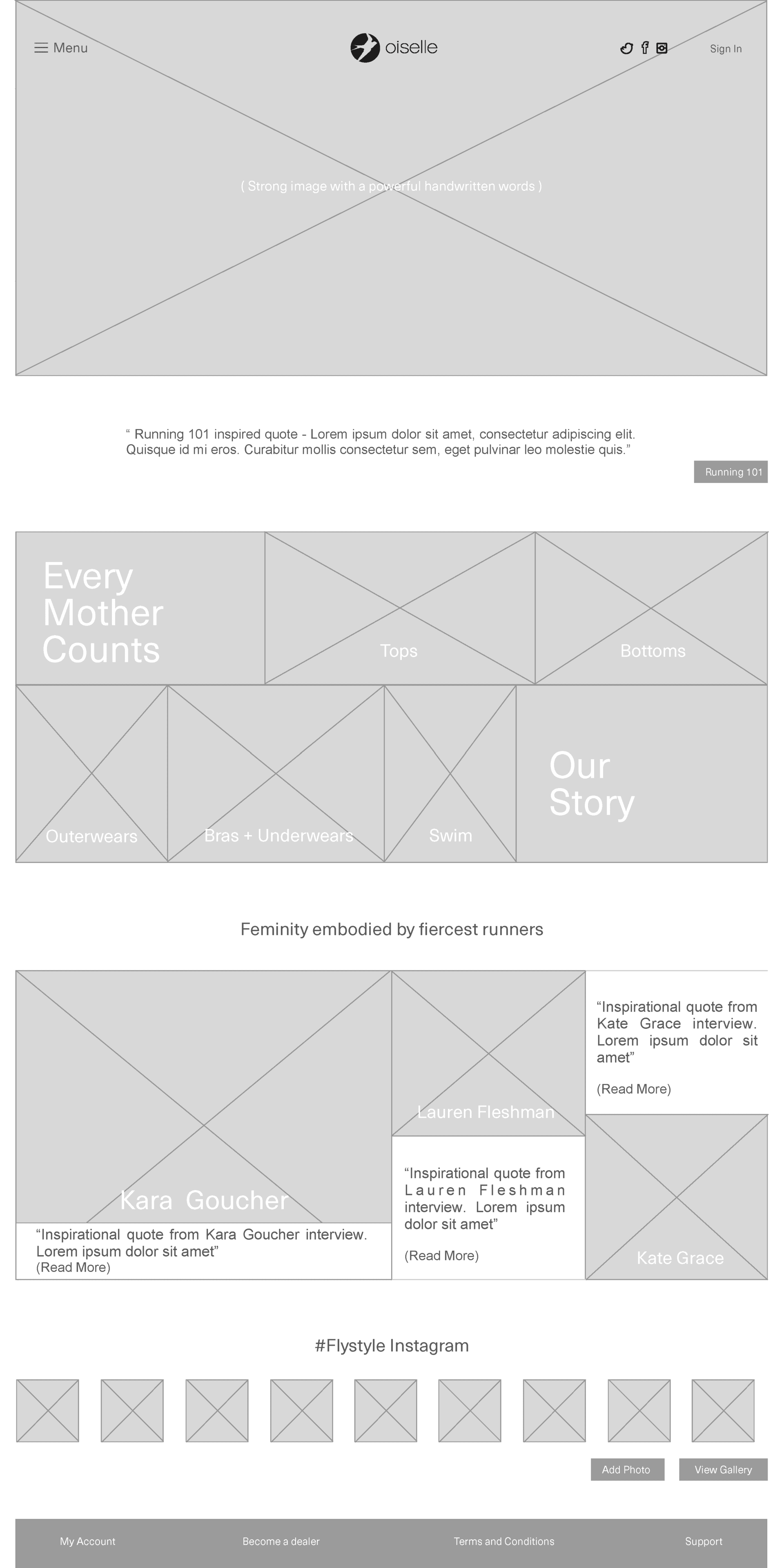
I created variations in design for homepage keeping in mind the modern, clean and geometric aesthetic.
• The first variation had the menu item exposed on the webpage.
The approach to the design was simple and strightforward.
• The second variation had the menu items hidden under the hamburger menu bar.
I tried to be slightly adventurous with the visuals adding lot of quotes and blog items on the homepage.
When presented to the class, I got the feedback to go ahead with the first variation for final design
as it was more user friendly.
Final Design
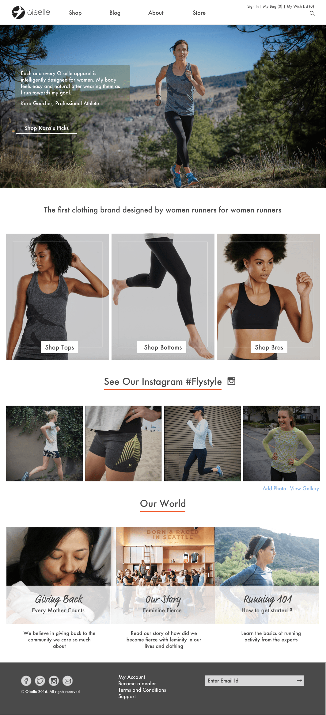
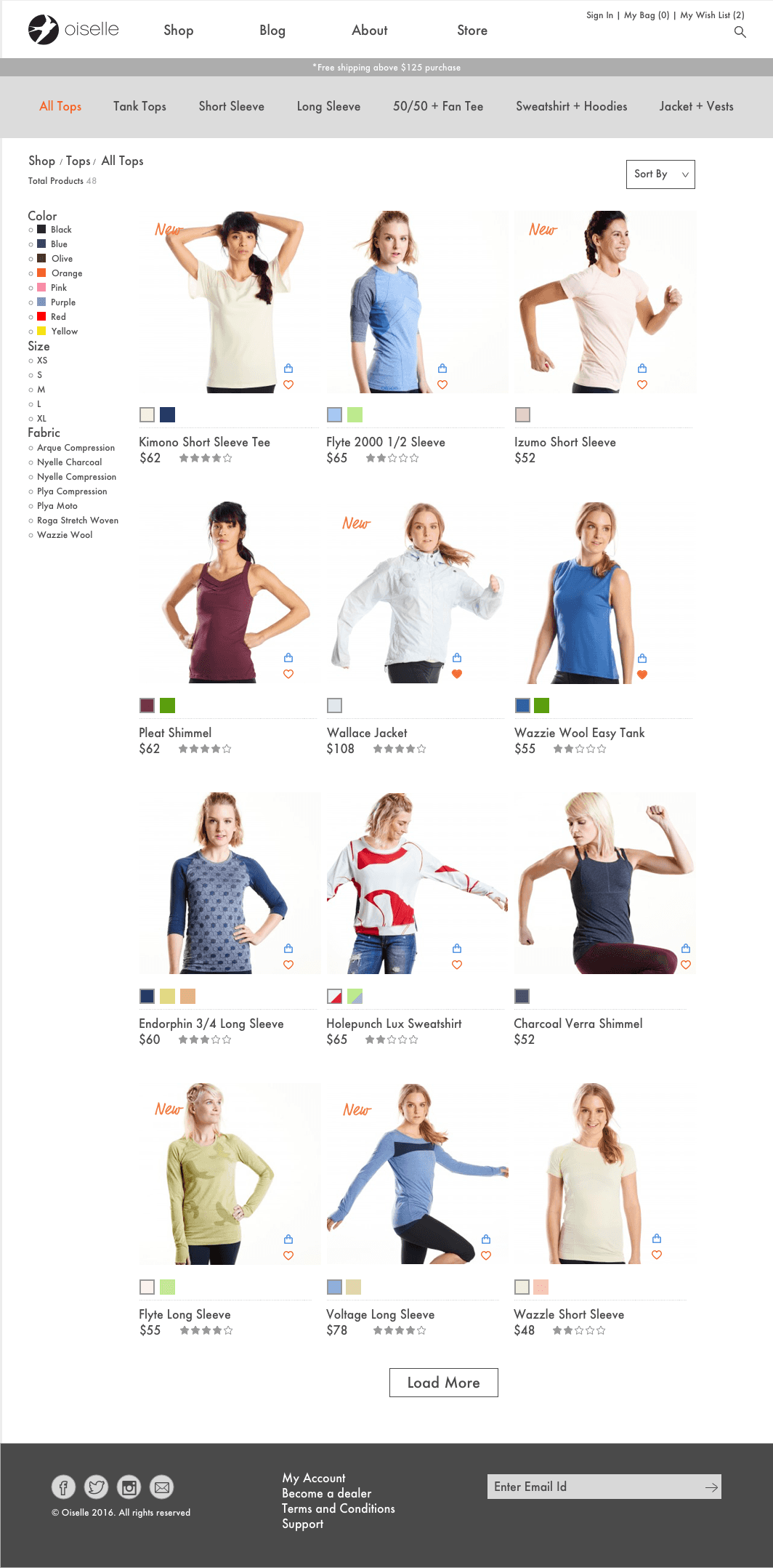
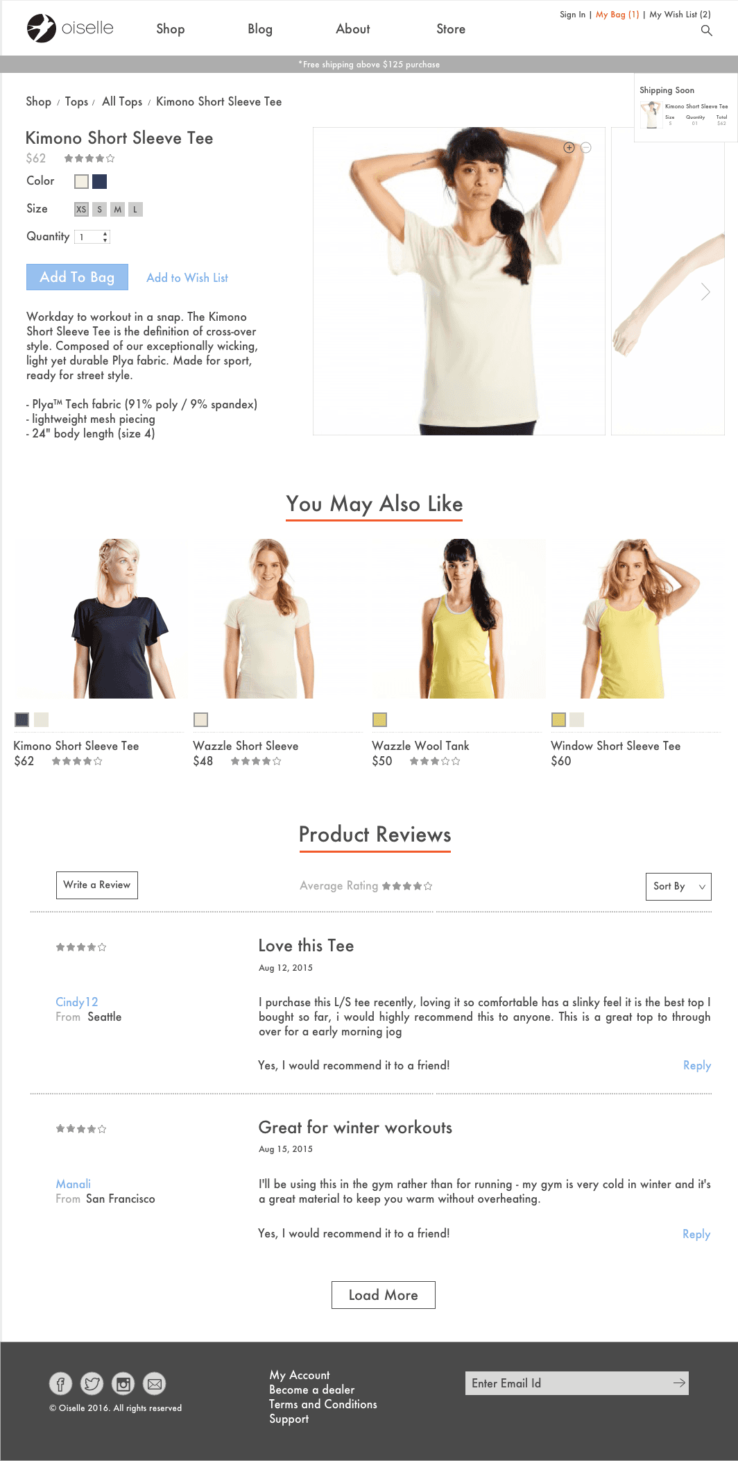
The wireframe was slowly built into visual design with several rounds of iteration. The final website consists of five webpages:
a. Oiselle Homepage
b. Product page
c. Product detail page
d. About page
e. Running 101 page
Prototype Link: Here
• I added the 'Futura' font to the body text
to represent the modern outlook while adding more grit to the website
• The images in the website layout was strucutred to give symmetric and clean aesthetic
• The art direction involved women in action
• Instagram feed and Blog was made a part of the homepage
to promote the community aspect of runners
• The color palette had orange, white and black as primary colors to signify the "Feminine fierce" vision of the brand.
The final design was presented to the clients for which I got very good remarks. It was used by them as reference for future website improvements.
Oiselle Web Refresh was a very different project from the one that I would normally work at Edifecs. It was
consumer-centric website driven by visual design. Prior to the class, I did not have much experience or proficiency in both but I got a good understanding of it because of the class instructor who divided our 10-week course
duration partly into theory and partly into project assignment. As students, we were learning both simultaneously. During the course, I could implement my acquired knowledge of visual design into the Oiselle project, present it to the class and receive feedback.


